Key Influencers & Decomposition Tree
You use AI visuals to automatically discover drivers and patterns in your data.
Why this lesson matters
Your data shows you what is happening. Revenue is falling, customer satisfaction is rising, margins are shifting. But the question your stakeholders ask is always: why?
The Key influencers visual and the Decomposition tree are two AI-powered visuals in Power BI that answer exactly that question. They automatically analyse which factors influence an outcome and let you navigate through your data interactively to find causes.
Key influencers: what drives your outcome?
The Key influencers visual analyses which factors have the most influence on a specific metric or outcome.
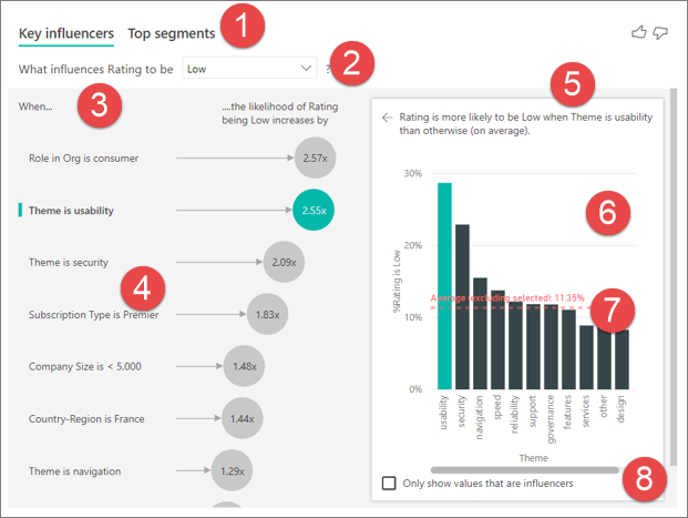
How to read the visual:
- Tabs At the top you switch between Key influencers (individual factors) and Top segments (combinations of factors).
- Target value You choose which outcome you're investigating, for example a low rating.
- Left pane The factors with the most influence, in order of importance.
- Right pane Click a factor on the left and you see on the right how much it counts, with an average line as a reference.
How it works
- 1You select a target variable (what you want to explain)
- 2You select explanatory factors (what might have an influence)
- 3Power BI automatically runs a statistical analysis
- 4The result shows which factors have the strongest influence, ranked by impact
Example: customer satisfaction
Target variable: Customer satisfaction score (high/low)
Explanatory factors: Delivery time, Product category,
  Region, Customer segment, Contact moments

Result:
- Delivery time > 5 days → 3.2x more likely to get a low score
- Product category = Electronics → 2.1x more likely to get a low score
- Customer segment = Enterprise → 1.8x more likely to get a high scoreThe Key influencers visual uses machine learning (specifically: logistic regression and decision trees) under the hood. You don't need any statistics knowledge to use it. Still, it's good to know that this is real analysis rather than guesswork.
Configuring Key influencers
Step by step
- 1Select the Key influencers visual in the Visualizations pane
- 2Drag your target variable to the Analyze field
- 3Drag explanatory factors to the Explain by field
- 4In the visual, choose whether you want to analyse what makes a value increase or decrease
Keep reading
Leave your name and email address and you can read the rest
You get the whole lesson right away, and every other lesson stays open after that. No password, no confirmation email.
Two views
| View | What it shows |
|---|---|
| Key influencers | List of factors, ranked by influence. Click a factor for details |
| Top segments | Groups in your data with the highest/lowest values. Shows combinations of factors |
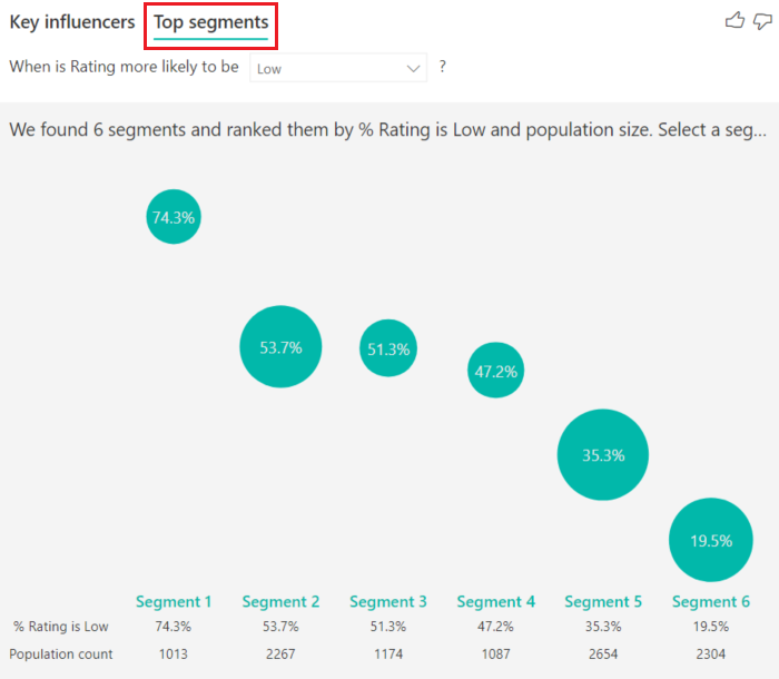
The "Top segments" view is worth its weight in gold for marketing and sales. It shows which single factor matters and which combination of factors has the strongest effect. For example: customers in region North + product category Software + enterprise segment have the highest margin.
Decomposition tree: breaking it down interactively
The Decomposition tree lets you navigate through your data step by step to understand how a total is built up.
How it works
You start with a total figure (say, total revenue) and keep choosing a dimension to zoom in on:
Total revenue: EUR 5.2M
  → By region: North (2.1M), South (1.8M), East (1.3M)
    → North by product line: Software (1.2M), Hardware (0.9M)
      → Software by customer: Customer A (0.5M), Customer B (0.4M), ...
You literally click your way through the data, and at every step you choose the next dimension.
The AI element
Here's the AI part: at every step you can choose "High value" or "Low value". Power BI then automatically picks the dimension that explains the highest or lowest value.
The AI suggestion is a starting point, and no more than that. Power BI picks the dimension with the most spread, and that isn't always the dimension that answers your business question. Use AI to explore, but also pick dimensions by hand that are relevant to your analysis.
Worked example: margin analysis
Your company's gross margin has dropped from 42% to 38%. Management wants to know why.
Step 1: Key influencers
Configure the Key influencers visual:
- Analyze: Gross margin percentage
- Explain by: Product category, Region, Customer segment, Sales channel, Discount percentage
Result: Discount percentage > 15% is the strongest driver of low margins, followed by Product category = Hardware.
Step 2: Decomposition tree
Start with total gross margin and break it down:
Gross margin: 38%
  → Sales channel: Direct (41%), Partner (33%), Online (39%)
    → Partner by region: North (35%), South (28%), East (36%)
      → South by product line: Hardware (22%), Software (34%)
Insight: The margin drop is largely driven by the partner channel in region South, specifically hardware products.
Tips for effective use
- 1Limit the number of explanatory factors - More than 8-10 factors makes the analysis hard to read
- 2Use clean data - Missing values and outliers distort the results
- 3Add context - The visual shows correlation; causation is a separate question
- 4Combine with filters - Use slicers to limit the analysis to relevant periods or segments
- 5Share with stakeholders - These visuals are ideal for interactive analysis in meetings
What does the Key influencers visual do in Power BI?
What is the difference between Key influencers and the Decomposition tree?
Want to keep your progress, get the practice files and sign up for the free evening? Create a free account. All you do is click a link in your email.
Create a free account